Design guidelines
Designing a great lenticular is not difficult, but there are many do’s and dont’s. Please use our experience in that filed and you can save a lot of time. We encourage you to contact us early in the creative phase to help you avoid common mistakes. Discussing your concept before providing final art is a really good idea. One simple change can transform a good lenticular project into a masterpiece.
FLIP
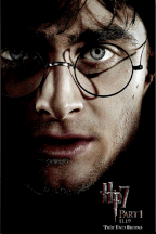
- Good flip is a two-image flip.
- Avoid high contrast in the most important areas of the image.
- High contrast could cause ‘ghosting’ (slight transition between images). Keep any “changing” images low contrast
- Sans fonts are better than serif. They are more readable.
AnimatiON

- Try to use 5-10 frames for animation although 25 frames are sometimes possible.
- Keep part of the image stable. When every part of the image is animating, the effect can be a bit disorienting.
- The more similar the frames, the more frames could be used in project.
- Try to use 5-10 frames for animation although 25 frames are sometimes possible.
3D

- Be careful with solid colour areas. There is small 3D effect on solid colour areas.
- There should be as many interactions among objects in design as possible.
- The closer to the focal point the object is, the sharper it will appear in lenticular design.
- Background images should have as many details as possible.
- Sans fonts are better than serif. They are more readable
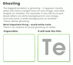
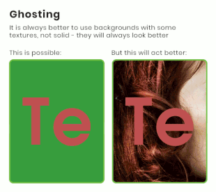
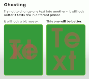
GHOSTING PROBLEM EXPLAINED